
framesmith 2.4: a phone is not a narrow web page
framesmith 2.4 is out. It’s the first release where a phone app screen is something framesmith actually knows about, instead of a web page that happens to be 390 pixels wide. Here’s why that mattered, and what’s new.
A perfect score with zero mobile checks
Before building any of this, I asked an agent to design one iOS screen with framesmith, following the docs to the letter: the home screen of a trail-running app, at phone size. It scored 100/100. The evaluator said READY TO PRESENT, with empty and loading states designed.
Not one mobile check had run.
framesmith treated the phone screen as a narrow web page. The tap-target rule only looked at form controls, and this screen had none, because on a phone almost everything you tap is a button, a row or a tab. So the rule checked nothing and passed. Nothing checked the status bar or the home indicator either. And there were no phone pieces to build with, so the agent hand-built the status bar, the tab bar and every list row out of plain frames. 93 nodes.
That’s the failure mode I worry about most with a quality gate: not a low score, but a high one on something it never looked at.
What’s new
Declare the medium
A phone screen is now something you declare:
canvas_create({ type: "mobile" })That gives you a 390×844 artboard whose root reserves 47px at the top for the status bar and 34px at the bottom for the home indicator. canvas_set_type declares an existing canvas web or mobile. Every evaluation now reports which rules the canvas’s type turned on, so “did the mobile checks run?” has a visible answer.
canvas_create also honours width and height now. It used to drop them, so every canvas came out 1440×900.
Judged as a phone
On a mobile canvas:
- A tap target under 44px is an error. Buttons, list rows, tabs, nav-bar actions, the tab bar’s centre action.
- Content under the status bar or home indicator is a warning, and so is content stuck under a pinned bar.
- Text has floors: body under 16px, prose under 13px, anything under 11px.
- A tab bar needs 2 to 5 labelled tabs, pinned to the bottom.
Each finding names its rule, so you can tell a phone problem from a general one. And a web canvas narrower than 500px now gets a warning until you declare what it is. That closes the loophole I fell into.
Built from phone pieces
New node types: status-bar, home-indicator, nav-bar, tab-bar, button, list-row and sheet. Plus position: "fixed" and "sticky" with bottom and right offsets, so bars pin to the screen. The renderer keeps content from starting or ending under a pinned bar, which is the bug you’d otherwise hit on every screen with a tab bar.
Started from phone structures
dashboard, settings, auth, onboarding, feed and detail each have a phone version, built only from the new pieces and tested against the phone rules in light, dark and under stress. You don’t pick it: apply_structure("dashboard") on a mobile canvas stamps the phone dashboard. A structure with no phone version, like pricing, is refused on a phone canvas, and the error lists the ones that work.
Shown as a phone
The viewer’s gallery cards keep each canvas’s own proportions, so phone screens show up as portrait cards. A phone canvas opens in a device frame, with a toggle that shades the status-bar and home-indicator areas.
The proof: same screen, rebuilt
The acceptance test for this release was rebuilding that same trail-running screen. It took 33 nodes instead of 93. Every tap target is a real button, row or tab, and it passes the phone rules in both themes.
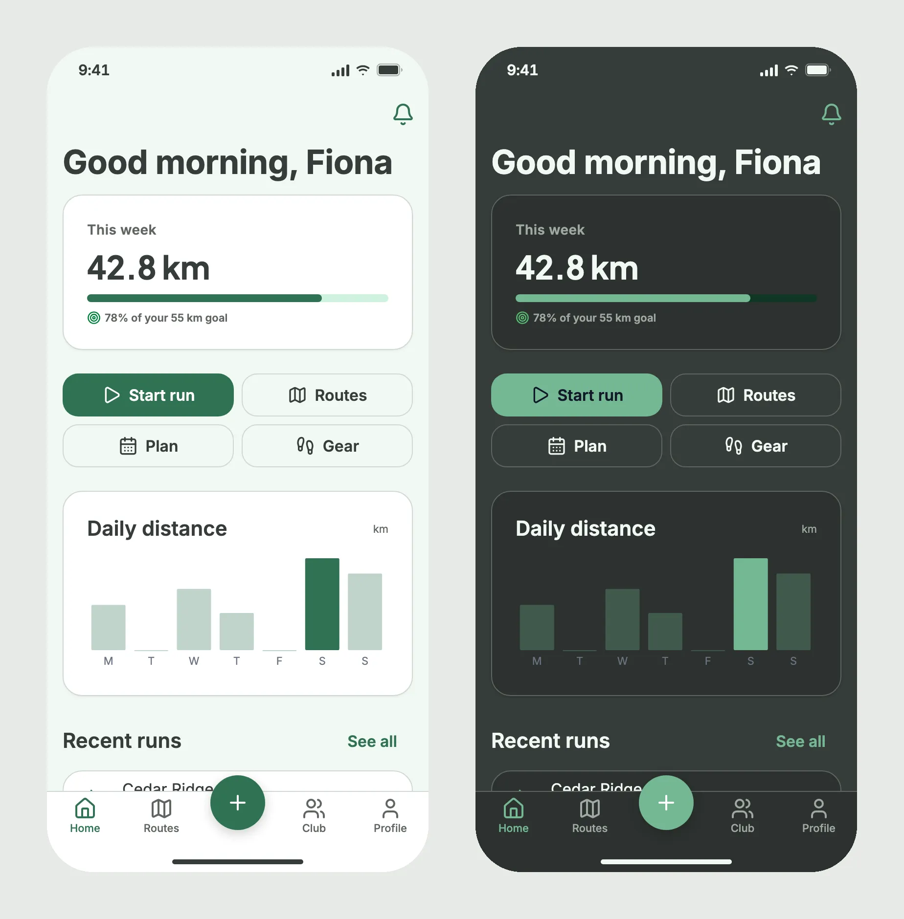
The rebuild also found two rendering bugs that no score could see:
- Big type rendered at 60% on a phone. Large sizes were scaled against a fixed 1440px width, so on a 390 artboard a 33px title rendered at 20px, smaller than the body text. Large type now scales against the canvas’s own width.
- Chart labels were squashed. Tick labels stretched with the plot. They now keep their 11px size, truncate inside their own slot, and centre under their bar.
Both are fixed, and that rebuild now runs as a test on every CI run. If I could keep one habit from this release, it’s that one: when your evaluator says something is perfect, rebuild the thing and look at it.
Smaller fixes
gap: 0is no longer flagged as off the spacing scale.- A chart
highlightaccepts a single index, not just an array. canvas_evaluatestays NOT READY after a failedcanvas_stressrun until a full clean run replaces it.- Detailed evaluation,
snapshot_layoutandcanvas_difflay out at the canvas’s own size instead of 1440×900.
Before you upgrade
Most of this is additive, but a few things behave differently:
- The
dashboardgenre is nowdata.dashboardstill works as an alias, and stored canvases keep their verdicts. If a repo is shared, everyone on it should run the same framesmith minor version, since older versions read the genre from the old field. - Web canvases narrower than 500px get a warning until you run
canvas_set_typewithmobileorweb. Like every warning, it holds the design at NOT READY. - Web canvases that aren’t 1440 wide render large type bigger. A 32px heading on a 1280 canvas used to render at 28.4px. It now renders at 32px. 1440 canvases render exactly as before.
- A FRAGILE stress run now blocks presenting. The result lives in server memory, so restarting the server forgets it.
Get it
npm i -g framesmith@2.4.0 # or just: npx framesmithRestart your MCP server so the new tools and rules load. The full release notes list every rule id and field.
framesmith is open source (MIT), renders to plain HTML/CSS, stores designs as open JSON you own in your repo, and works with any MCP-compatible client.